Alpinum — Branding, Art Direction & Identity
ALPINUM >> Branding > Art Direction > Graphic Design > Identity > Cerdanya, Girona, Spain
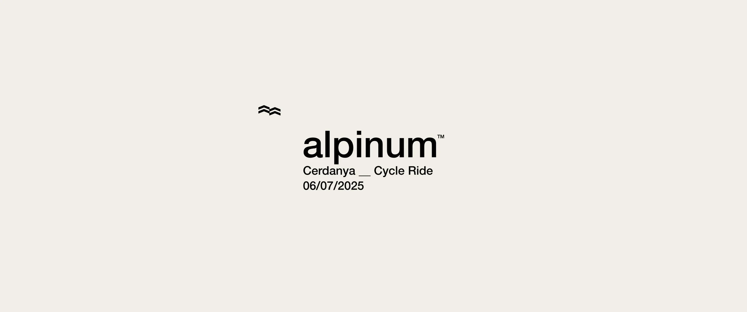
Alpinum is a premium mountain cycling tour set in the Cerdanya region, defined by altitude, endurance, and a strong sense of community.
At EH! Studio, we have led the brand’s visual identity and creative direction across multiple editions — shaping Alpinum into a recognizable and aspirational event within the European cycling calendar.
From the core identity to each annual evolution, our work establishes Alpinum as more than a ride:
a cultural and athletic experience rooted in territory, challenge, and belonging.


Starting Point
Alpinum was growing quickly, both in participation and ambition.
The event already had a powerful setting and a demanding route — but needed a clear brand structure capable of:
Scaling across editions
Attracting a committed cycling audience
Communicating exclusivity without elitism
Translating altitude, effort, and emotion into a visual language
Our role was to give Alpinum a long-term identity, not just an annual look.

The Challenge
Build a strong, distinctive identity capable of evolving year after year.
Position Alpinum as a premium mountain cycling event with its own voice.
Create a visual system flexible enough to adapt to different editions while remaining coherent.
Connect performance, landscape, and community through design.
Strategy
We defined Alpinum as a brand built around three pillars:
Altitude as character
The mountain is not a backdrop — it’s the protagonist.
Effort as culture
Performance, endurance, and respect for the terrain.
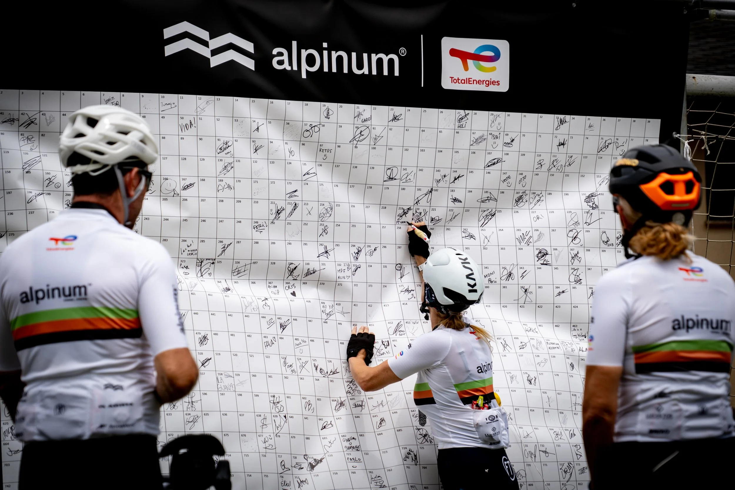
Community as value
A shared experience that goes beyond the ride itself.
From this, we developed a modular identity system:
stable at its core, flexible in its yearly expression.
Identity System
We created a visual language designed to evolve with each edition:
A solid, recognizable logo system
Typography and graphic elements inspired by elevation, maps, and routes
A restrained color palette adapted per year
Visual codes that connect print, digital, apparel, and on-site materials
Each edition introduces nuances — but always within the same brand framework.

ALPINUM 025 — Refinement & Positioning
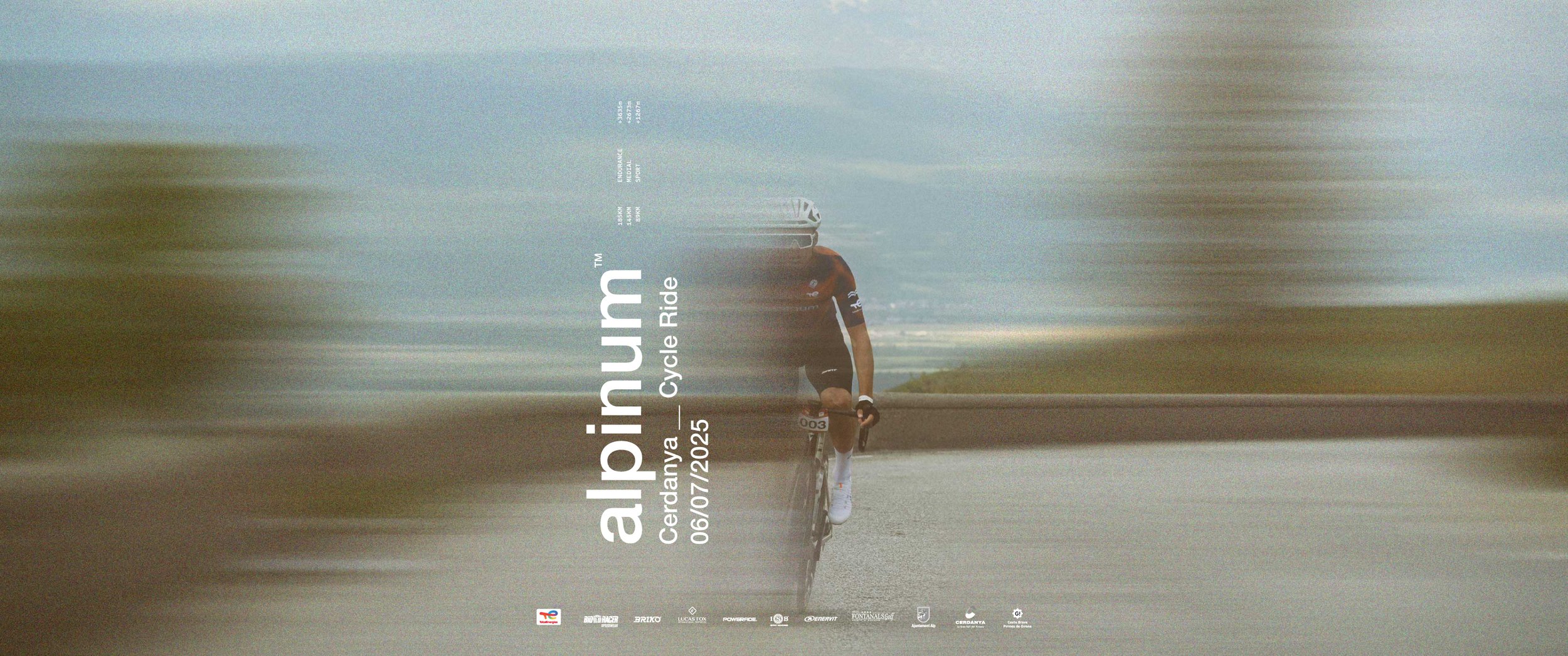
For the 2025 edition, the goal was elevation.
We refined the identity to position Alpinum as a benchmark in mountain cycling:
Sharper art direction
More editorial visuals
Greater emphasis on exclusivity, rhythm, and experience
The brand matured — becoming more confident, more selective, and more aspirational.
ALPINUM 024 — Establishing the Foundation
The 2024 edition focused on consolidation.
We set the visual and narrative base of the brand:
Clear hierarchy
Strong graphic system
First fully coherent application across all touchpoints
This edition established Alpinum as a serious, well-articulated event with its own identity.
Art Direction
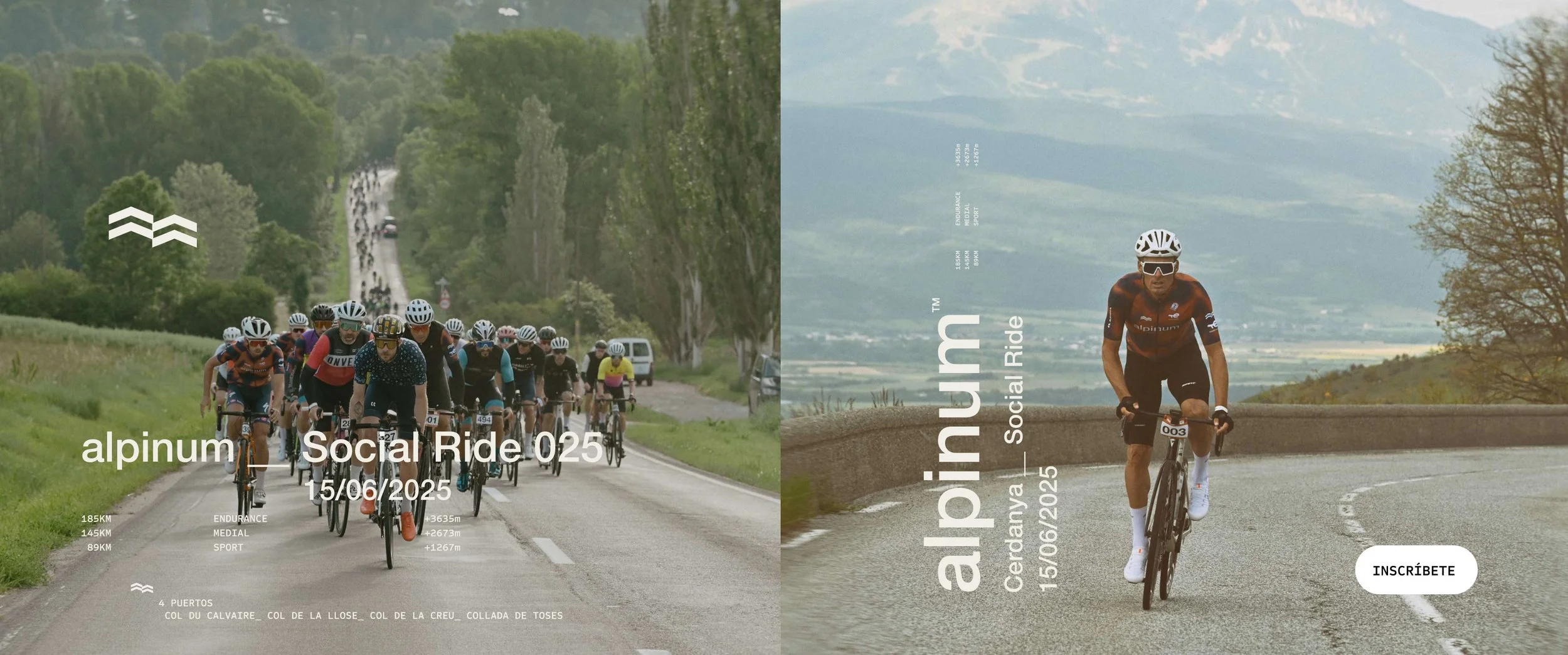
The visual universe balances raw landscape with controlled design.
Natural light and real terrain
Documentary-style photography with editorial framing
Graphic overlays inspired by altitude profiles and routes
It’s not about spectacle — it’s about truthful intensity.

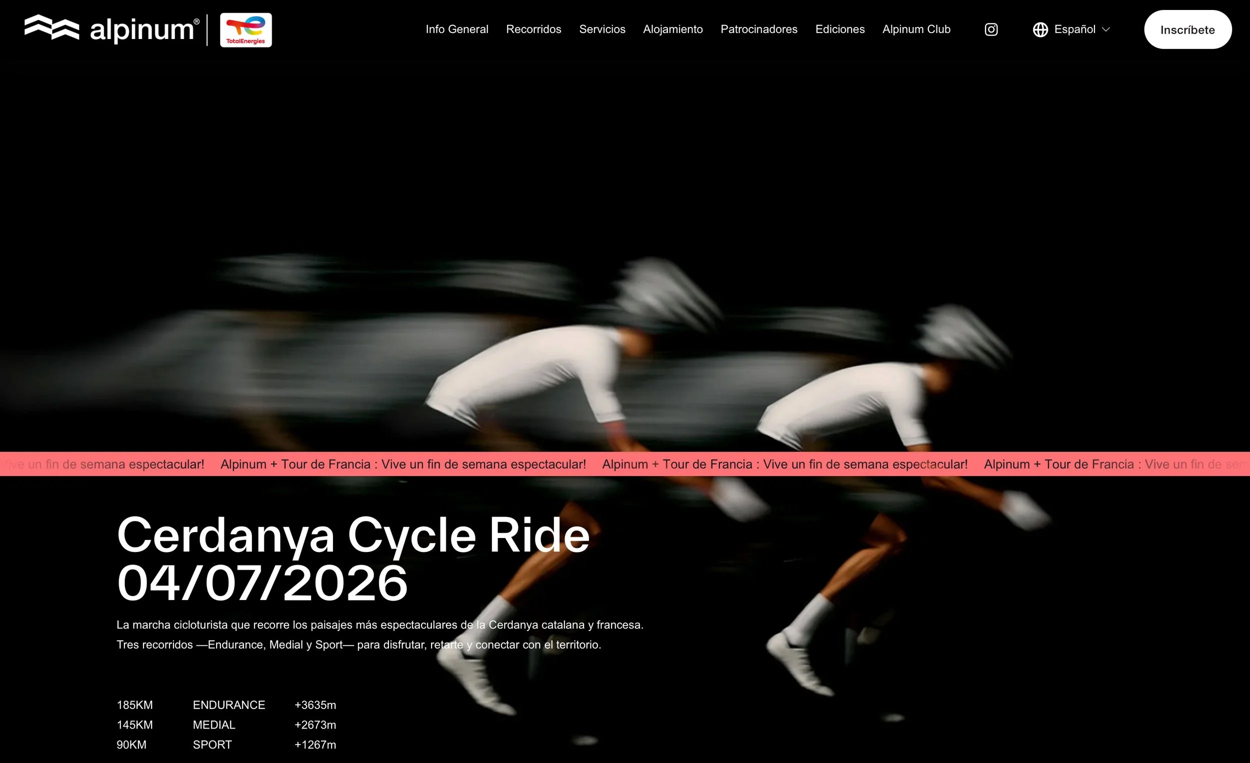
Applications
The identity was applied consistently across:
Official jerseys and apparel
Website and digital communication
Posters, banners, and on-site elements
Social media and campaign visuals
Every touchpoint reinforces the same message:
Alpinum is demanding, honest, and deeply connected to its environment.

Campaign Film — Visual Identity in Motion

Today, Alpinum stands as:
A recognizable and coherent cycling brand
A premium event with a strong sense of identity
A platform capable of evolving edition after edition without losing its essence
We continue to work alongside the Alpinum team, refining the brand and guiding its evolution — ensuring that each new edition remains faithful to what defines it:
altitude, effort, and community.