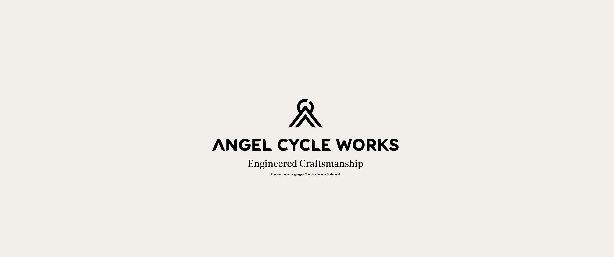
Angel Cycle Works — Branding, Art Direction & Identity
Angel Cycle Works >> Branding > Art direction, Graphic Design > Identity > Oleiros, A Coruña, Spain
Angel Cycle Works is a Spanish brand of custom-made titanium bicycles, built with technical precision, artisanal soul, and timeless design. At EHStudio, we lead their visual identity, graphic universe, and brand storytelling — crafting a digital presence that is consistent, aspirational, and unique.
We work closely with ANGEL every day, refining their branding and narrative to express what truly defines them: silent engineering, meticulous attention to detail, and a restrained aesthetic that resonates with demanding cyclists seeking exclusivity, personality, and performance.
Starting Point
Build a clear, modern identity aligned with the real value of the product.
Establish an honest, calm, and elegant communication tone.
Define a consistent visual language across web, communication, and campaigns.
Elevate brand perception in an extremely demanding segment.
Prepare the launch of HEAVEN and MIRACLE with a story worthy of the product.

The Challenge
ANGEL Cycle Works is a Spanish premium titanium bicycle brand a project built from an obsession with precision and a deeply personal way of understanding cycling.
When the brand came to EH! Studio, they had an extraordinary product, but needed structure, narrative, and a digital presence capable of communicating their true level.
Our role was clear:
to give shape, coherence, and direction to a brand with a strong essence, but still without a defined language.

Strategy
We researched the premium titanium market and studied how the key references communicate.
From there, we defined the brand territory for ANGEL:
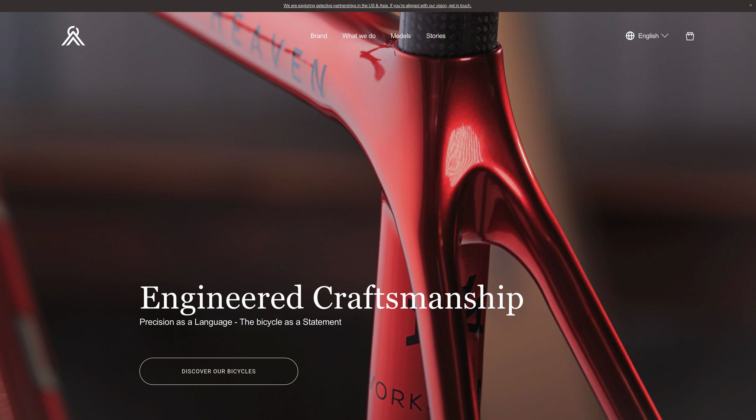
Engineered Craftsmanship
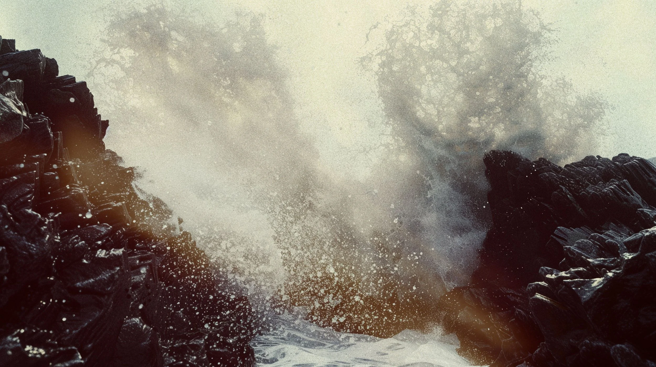
The intersection of technique and emotion.
Precision, silence, aesthetics, and sensitivity.
A concept that guides every text, every image, and every creative decision.


Storytelling
We rewrote the brand’s entire narrative — its story, its purpose, and the message of each model.
We created a unique editorial tone:
Clean, specific, and emotionally restrained.
HEAVEN — Titanium Road Precision
MIRACLE — Gravel bike engineering
Every text was designed to transmit confidence, clarity, and real value.
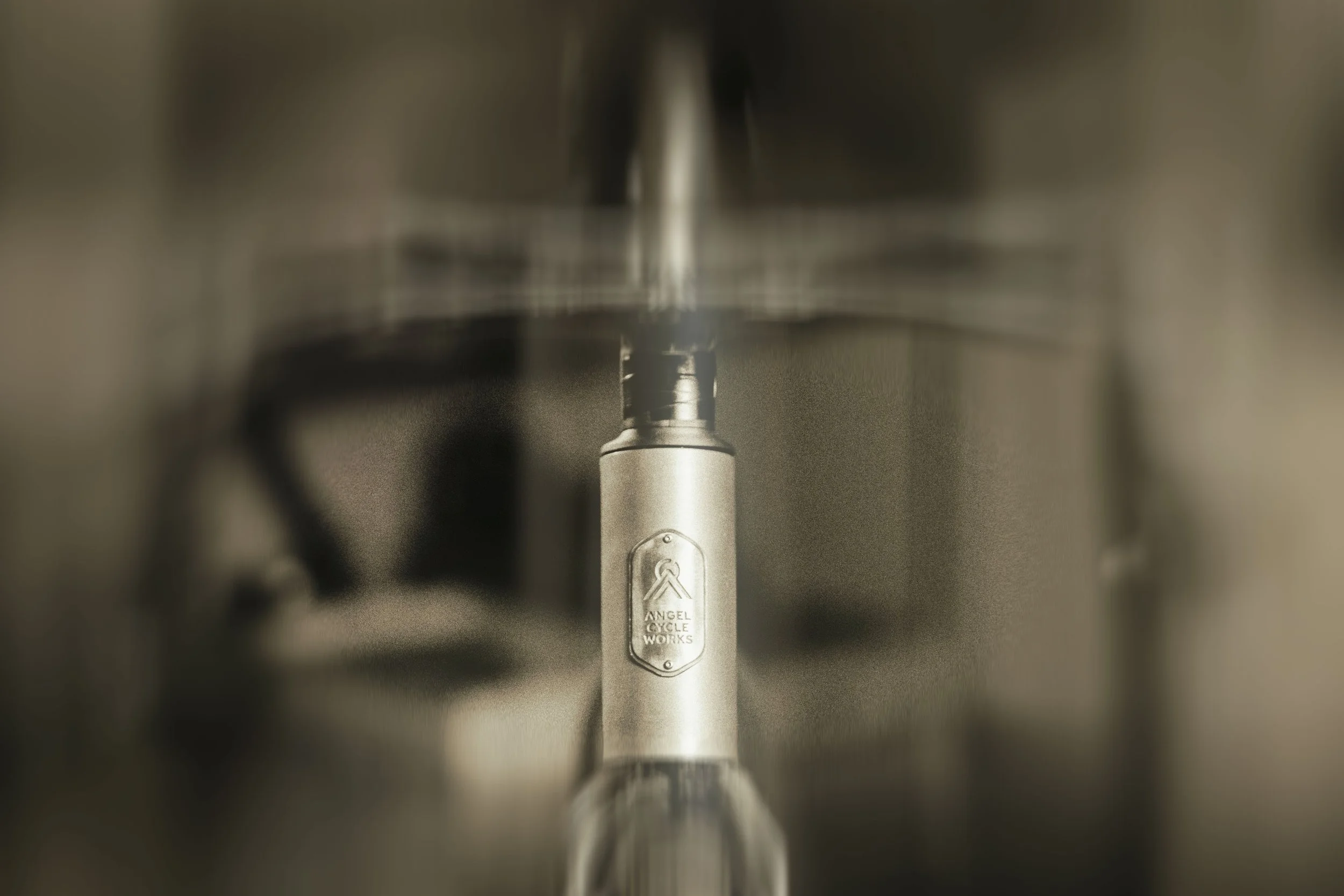
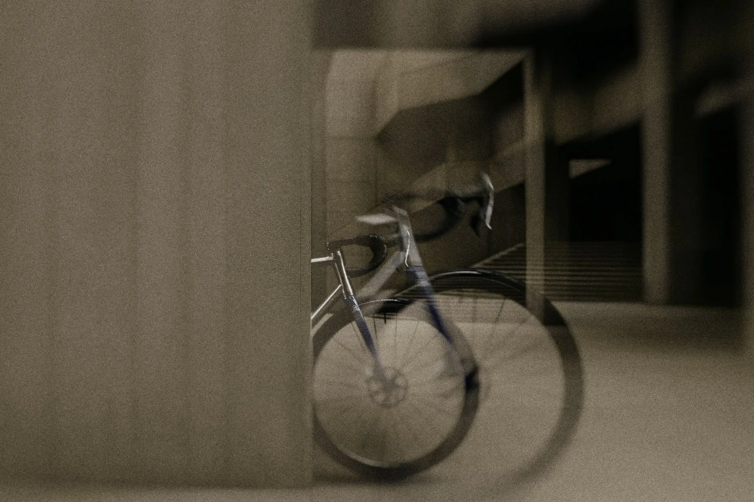
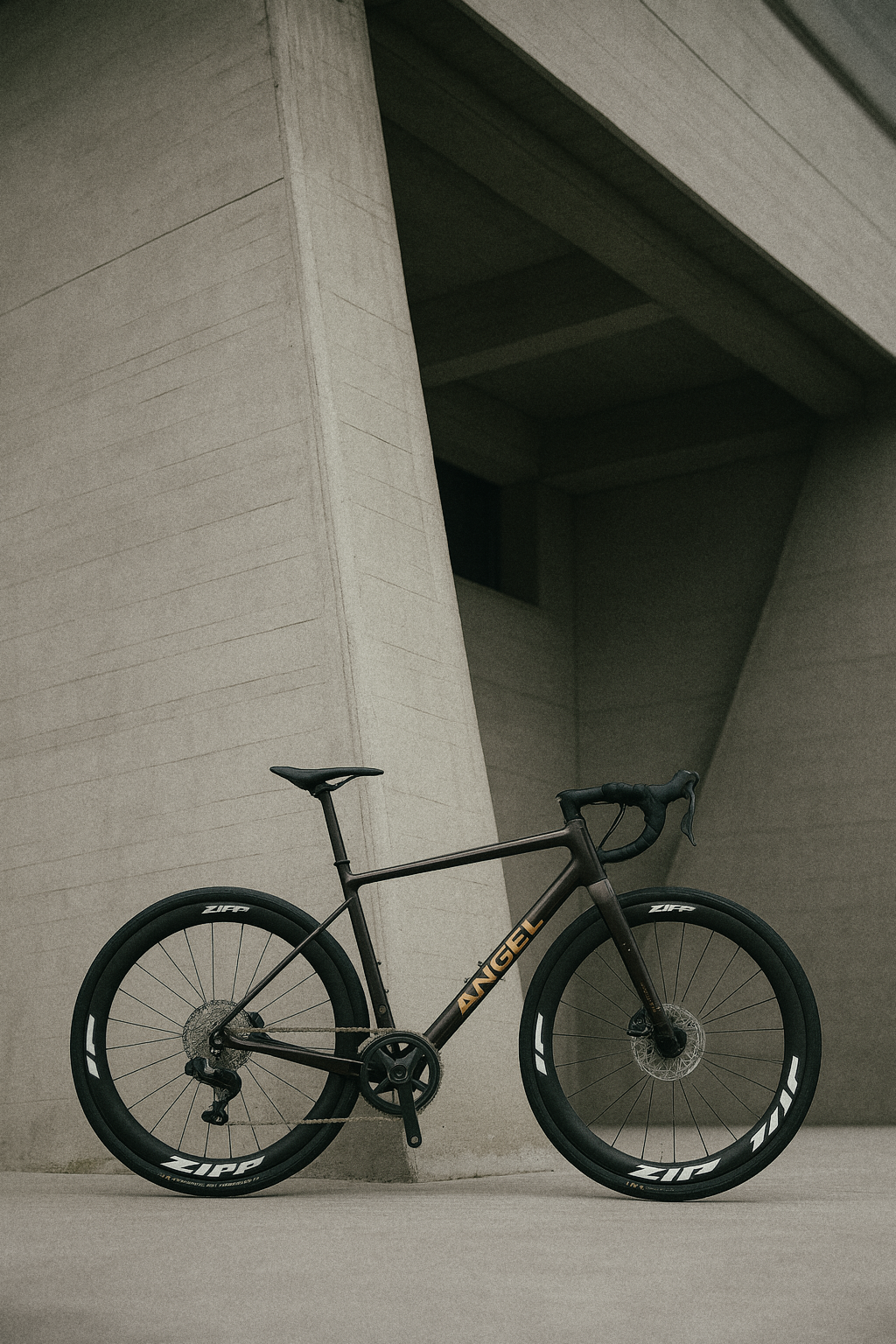

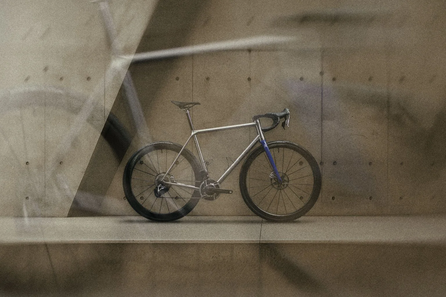
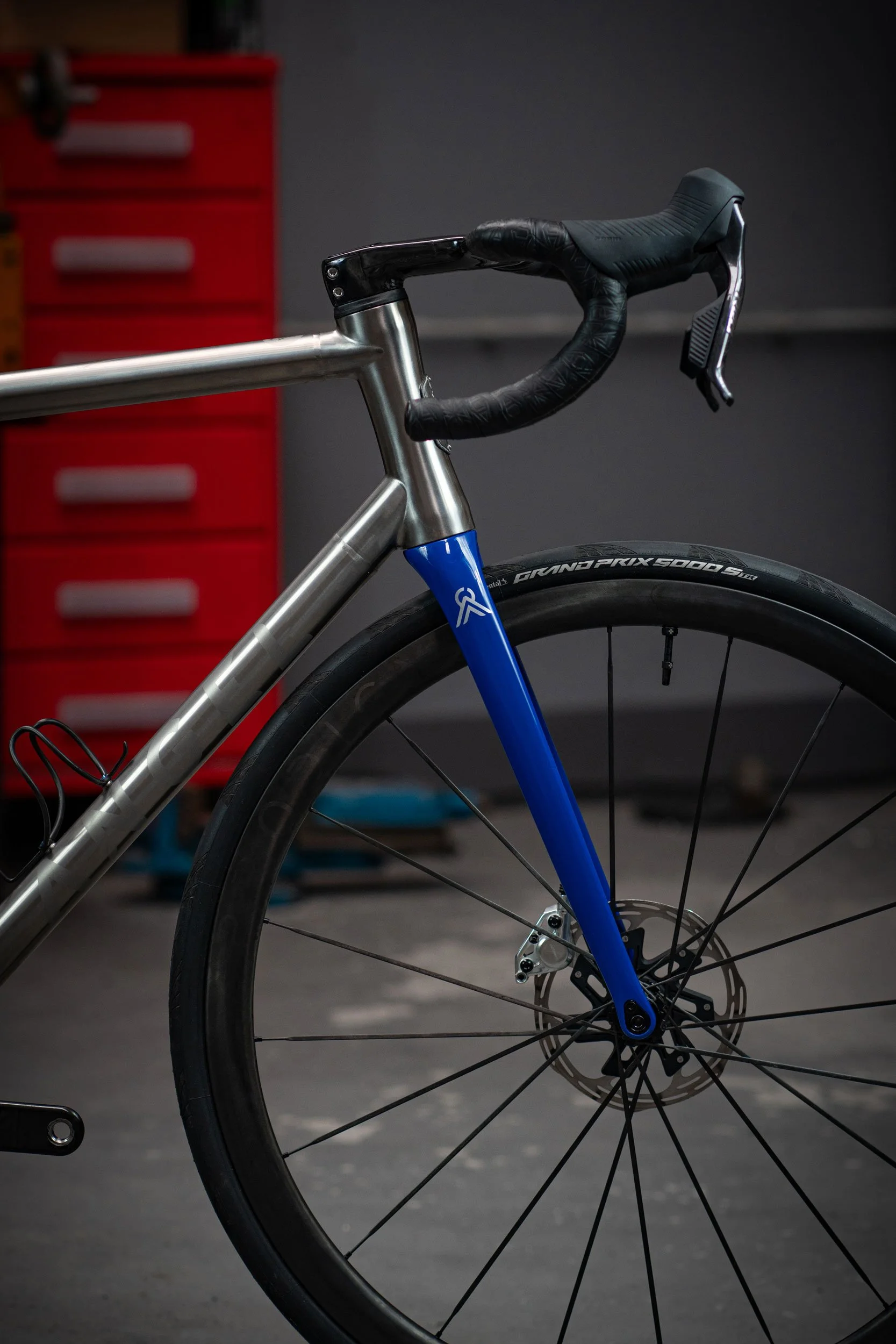
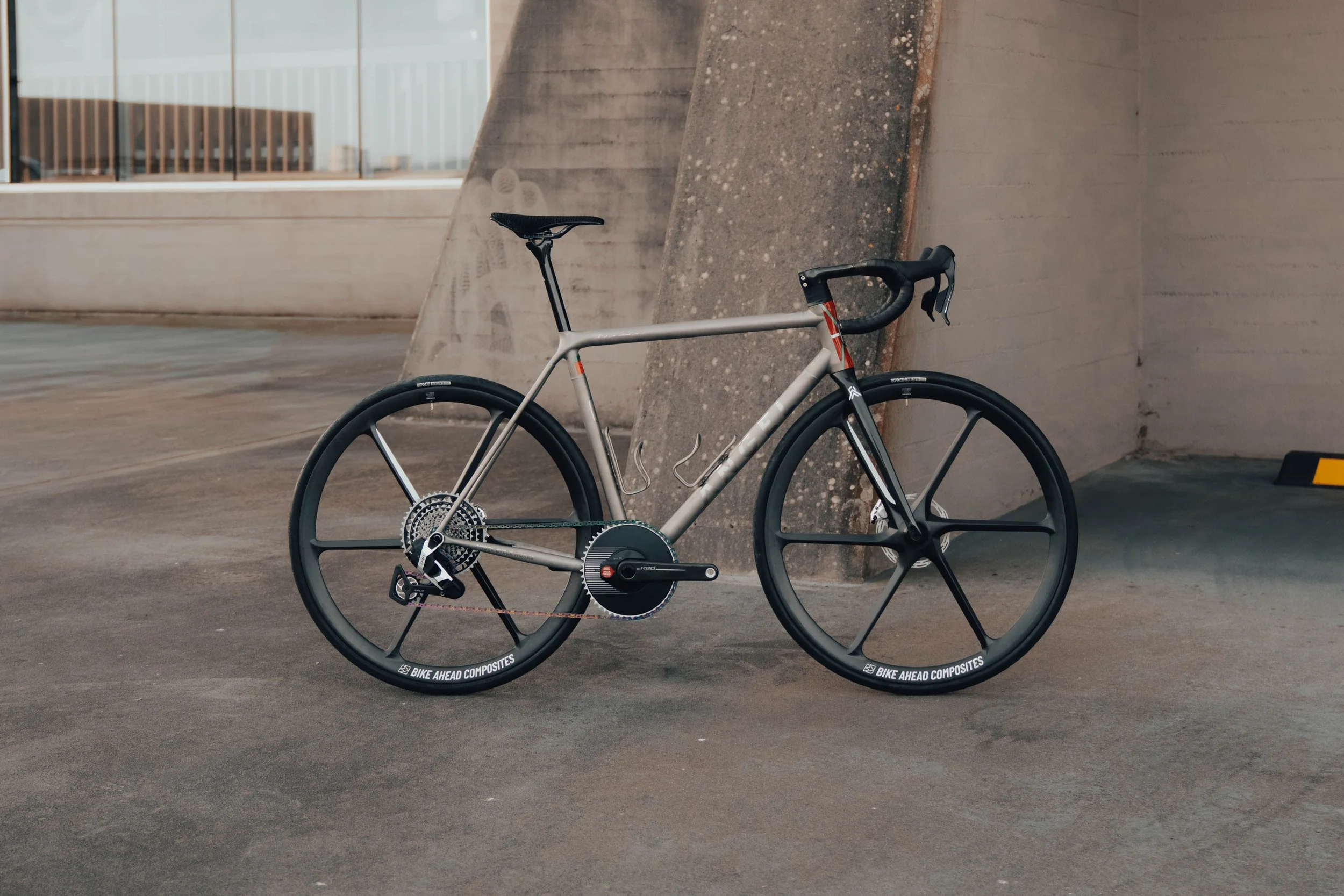
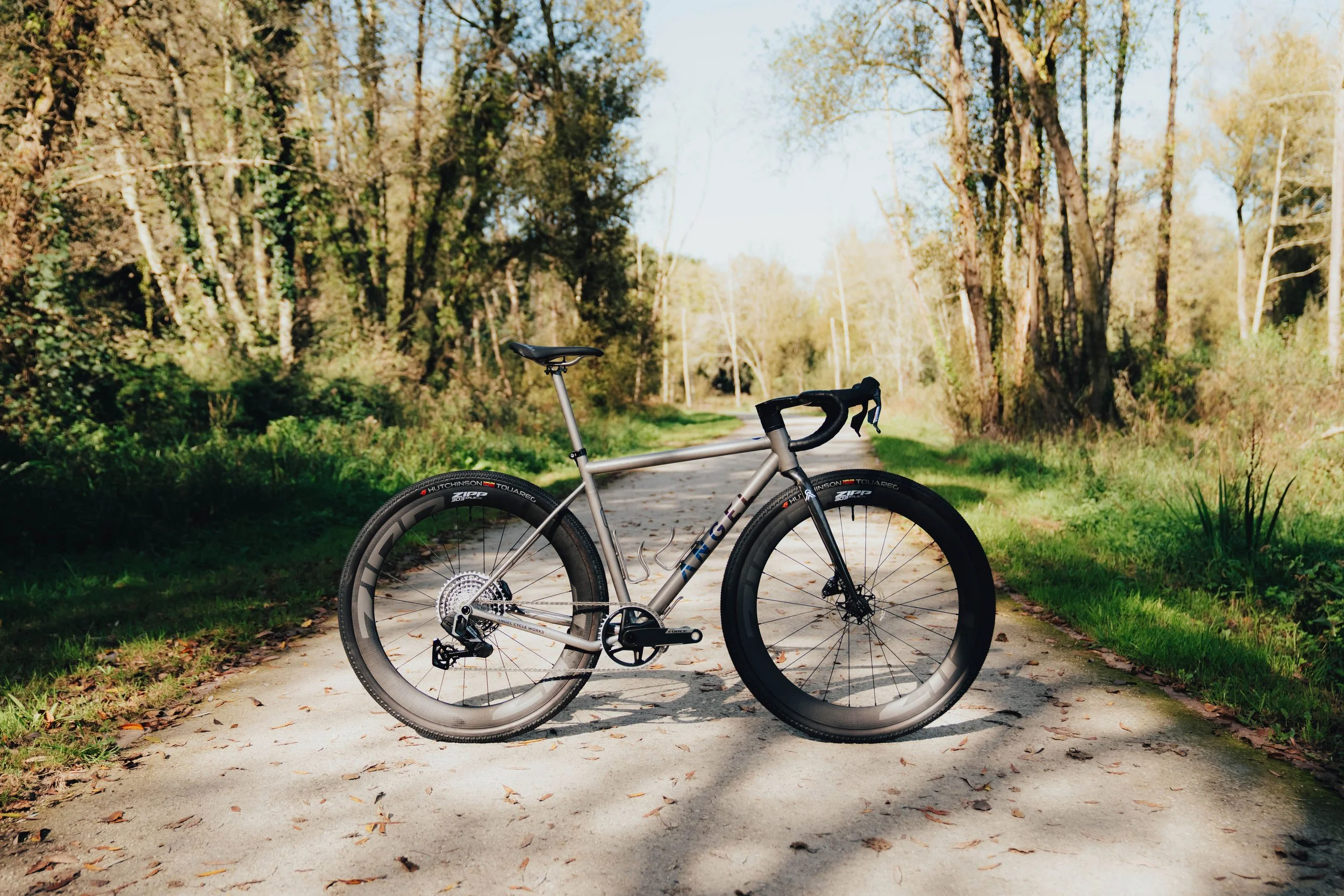
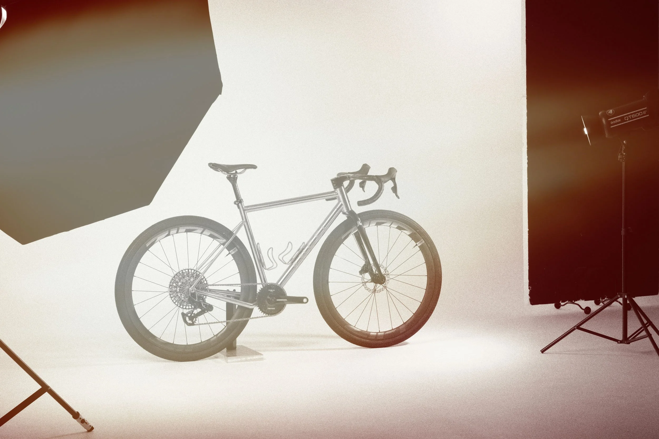
Art Direction
We developed a minimalist, editorial visual universe.
Natural light, neutral tones, and a refined industrial aesthetic.
It’s not just about showing bikes — it’s about showing the ANGEL way of seeing cycling.
We created hero visuals, aspirational imagery, and visual systems.
Web Design
The site was built around one principle:
Less noise, more intention.
Minimalist, narrative-driven structure
A homepage with progressive storytelling
Optimized technical SEO and editorial copy
Product pages with hero visuals, narrative, geometry, and clear CTAs
The Result
Today, ANGEL Cycle Works has:
A defined and coherent identity
A refined, recognizable tone of voice
A solid, evolving visual universe
A clean, precise website that reflects what the brand stands for
Ongoing support that sharpens its communication every day
We continue to work alongside the ANGEL team as partners in storytelling and design — helping the brand evolve and remain as meticulous as the bicycles it creates.