MAAP Custom — Creative Design & Visual Culture
MAAP Custom >> Creative Design > Apparel > Melbourne, Australia
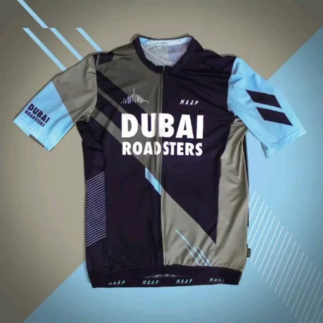
MAAP is a global cycling brand known for redefining the visual language of performance apparel. Through MAAP Custom, the brand explored external collaborations and bespoke projects during a formative period of its expansion.
During two years, I collaborated closely with the MAAP Custom team, developing custom apparel projects at a moment when the brand’s visual and cultural language was already established and rapidly evolving. In that period, I was one of the few external designers working continuously with MAAP.
More than a professional collaboration, MAAP represented a defining creative stage.

Starting Point
MAAP was already a highly refined brand with a clear visual identity and global recognition.
The challenge was not to redefine MAAP, but to work inside its logic — respecting its codes while contributing with clarity, rigor, and consistency across custom applications.
Each project required sensitivity, precision, and an understanding of MAAP’s design philosophy:
Less noise.
More intention.
The role was subtle but demanding: to design without ego, and to contribute without disrupting the system.
The Challenge
Engage with MAAP’s visual culture from within a real production and brand environment.
Translate an already strong identity into custom projects without diluting its essence.
Apply graphic culture, restraint, and proportion to performance apparel.
Understand design as a cultural system, not as surface decoration.


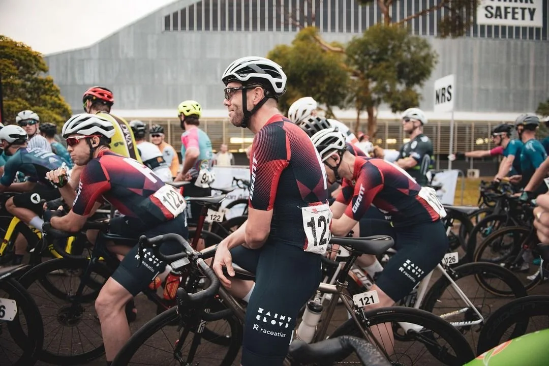
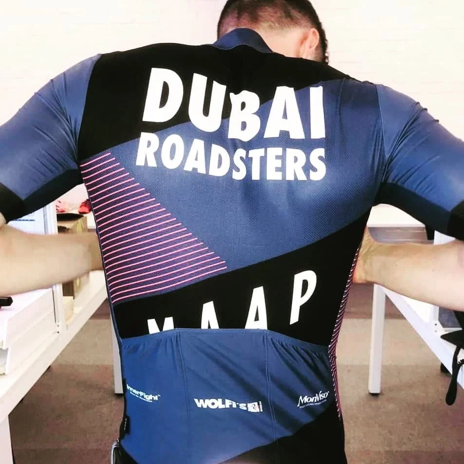
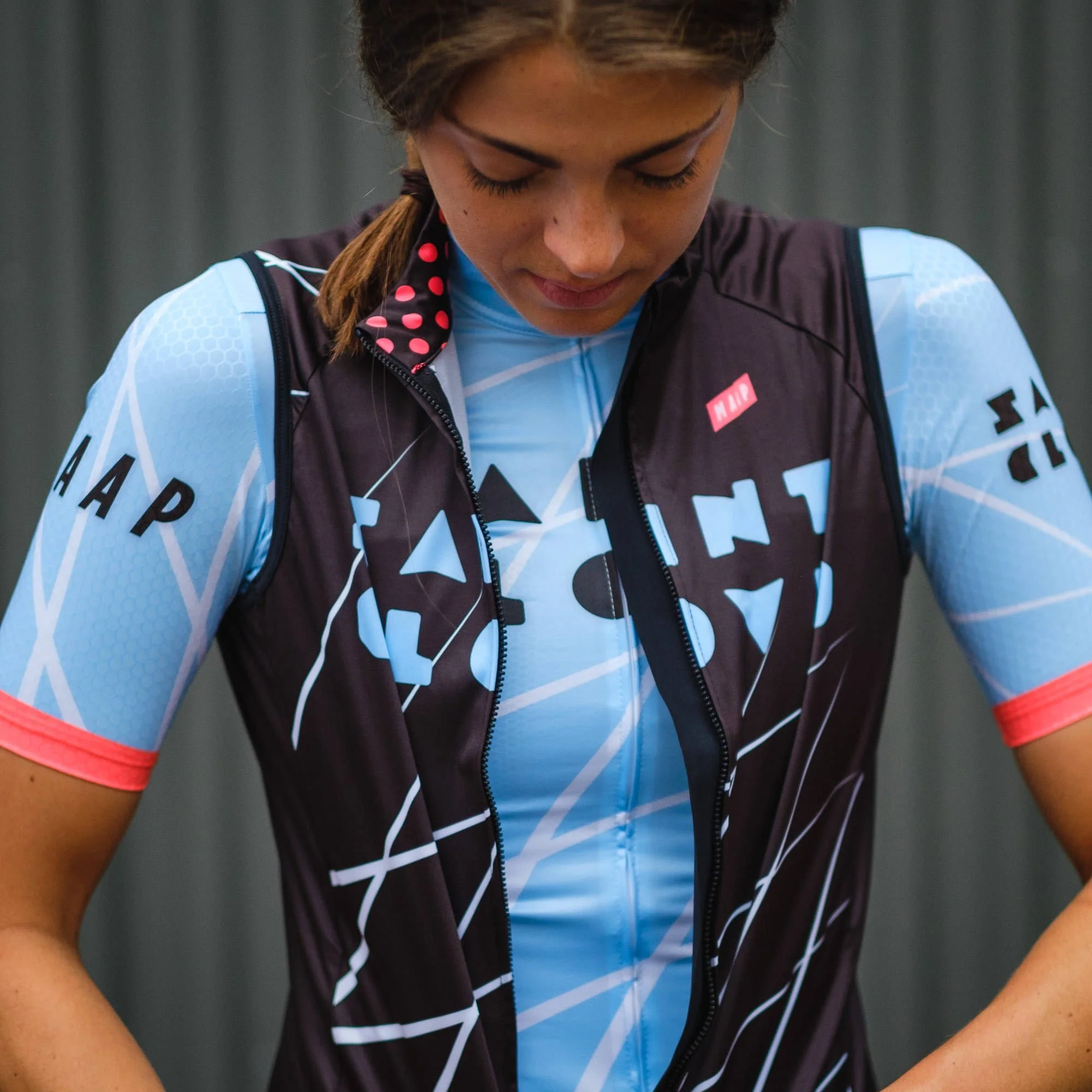
The Result
Creative Design
Working with MAAP meant embracing design as culture rather than trend.
The focus was placed on:
Proportion over excess
Typography as structure
Rhythm as visual coherence
Material and function as design drivers
This period reinforced a way of thinking design where performance, aesthetics, and restraint coexist naturally.

What This Project Represented
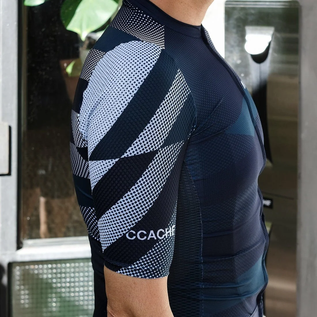
Visual Language
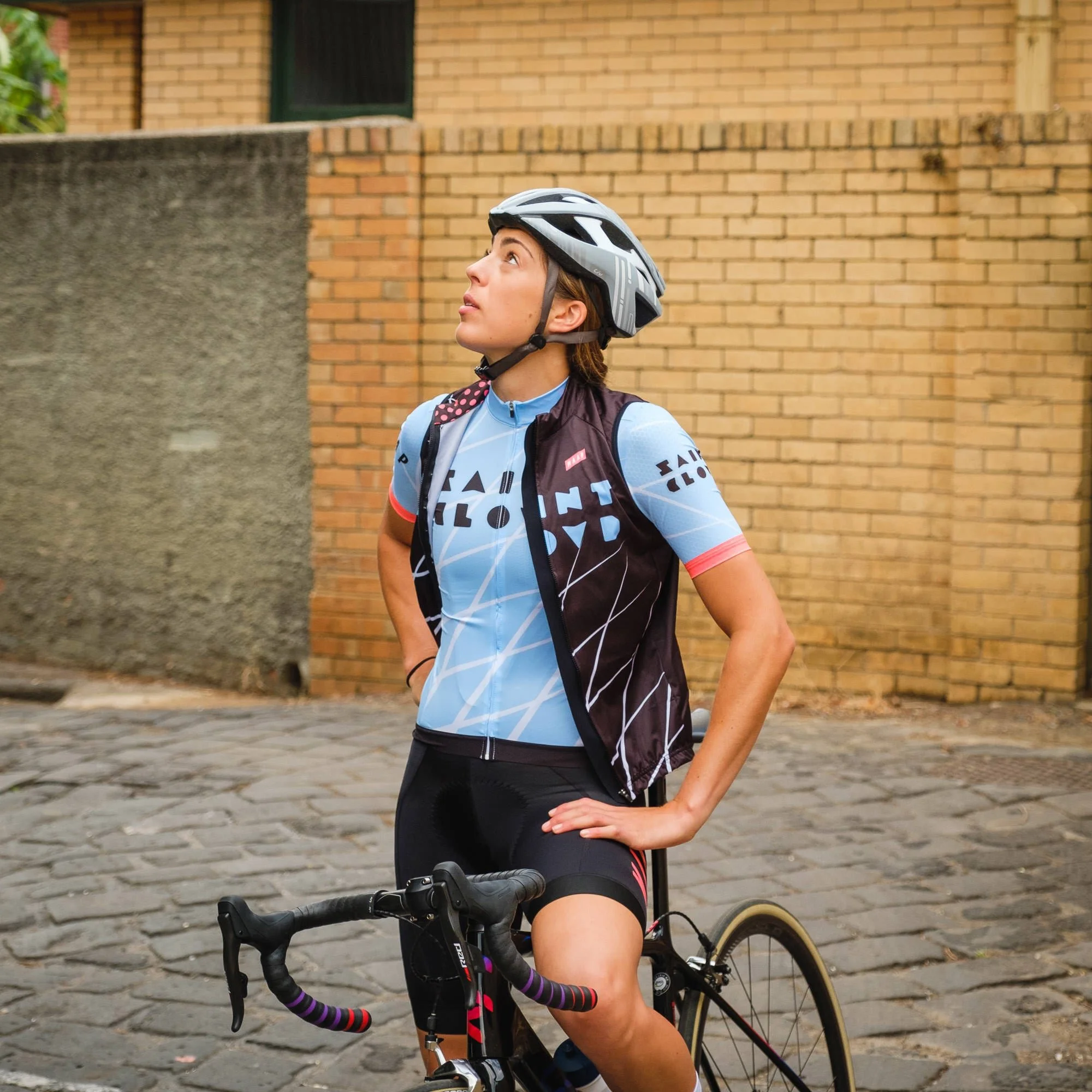
MAAP’s visual language operates with discipline.
Clean compositions
Controlled color usage
Strong typographic hierarchy
Graphic systems designed to support movement and performance
Custom projects had to feel unmistakably MAAP — calm, precise, and confident.
This collaboration marked a moment where design stopped being execution and became direction, culture, and language.
It confirmed a personal approach to design already in formation and gave it context, discipline, and maturity.
In many ways, MAAP didn’t change how I design — it validated it.
One could say MAAP belongs to a wider design movement within cycling culture: a shared visual sensitivity that influenced a generation of brands and designers. An unofficial logic that could be described as MAAPism.


This period left:
A deep understanding of global brand systems
Design discipline applied to performance products
A reinforced editorial approach to visual culture
A key professional and personal inflection point